Design System
Design to Code - An example workflow
Figma is the single source of truth. Tokens sync to code automatically, components are read straight from Figma via the Figma MCP, and everything here is built from those tokens only.
Workflow
Two paths, one source of truth. Values flow automatically, structure is read on demand.
Tokens · fully automated
- StructureClaude defines layers and naming
- DesignFigma Variables hold every value
- SyncToken Bridge commits tokens to GitHub
- BuildA GitHub Action writes tokens.css
Components · via Figma MCP
- DesignFigma component with bound variables
- ReadClaude reads it via the Figma MCP
- ReviewDesign QA: wrong bindings get fixed in Figma
- CodeExisting components are reused
Where a standard exists, use it. Where none fits, build the gap.
Figma's Variables REST API is Enterprise-only, so tokens travel through a custom plugin. For components, the Figma MCP is the standard, so it is used as is.
From Figma to a live component
How the Sign-up Card went from Figma to code. Two MCP reads, no hand-written spec.
-
1. Select the component in Figma
Right-click the component set, copy the link to the selection. The link carries the node id, so only this component is read.
-
2. Claude reads it via the Figma MCP
One call to
get_design_contextreturns every state, the auto layout, the text styles and the variable bound to each layer. -
3. Design QA, then read again
The first read showed foreign library variables and mixed-up tokens that no screenshot would reveal. They were fixed in Figma, a second read confirmed it.
-
4. Translate into the project
The MCP returns a React + Tailwind reference. It is adapted to this project: Form Field, Checkbox, Alert and Button are reused, only the card layout is new. Full breakdown
One token, three layers
Aliases survive the whole way from Figma into CSS.
/* Component */
--button-primary-bg-default: var(--color-action-primary-bg-default);
/* Semantic */
--color-action-primary-bg-default: var(--color-purple-600);
/* Primitive */
--color-purple-600: ;
Use it in your project
No install needed. The CSS is served straight from the public repository via jsDelivr.
-
1. Add the stylesheets
Tokens first, then the components you need. Plus the two web fonts.
<link rel="stylesheet" href="https://fonts.googleapis.com/css2?family=Oswald:wght@500;700&family=Roboto:wght@400;500&display=swap">

<link rel="stylesheet" href="https://cdn.jsdelivr.net/gh/Tobias-Stoll/DesignSystem@main/dist/tokens.css">
<link rel="stylesheet" href="https://cdn.jsdelivr.net/gh/Tobias-Stoll/DesignSystem@main/dist/typography.css">
<link rel="stylesheet" href="https://cdn.jsdelivr.net/gh/Tobias-Stoll/DesignSystem@main/components/button.css">
<link rel="stylesheet" href="https://cdn.jsdelivr.net/gh/Tobias-Stoll/DesignSystem@main/components/input.css">
<link rel="stylesheet" href="https://cdn.jsdelivr.net/gh/Tobias-Stoll/DesignSystem@main/components/checkbox.css">
<link rel="stylesheet" href="https://cdn.jsdelivr.net/gh/Tobias-Stoll/DesignSystem@main/components/alert.css">
<link rel="stylesheet" href="https://cdn.jsdelivr.net/gh/Tobias-Stoll/DesignSystem@main/components/form-field.css">
<link rel="stylesheet" href="https://cdn.jsdelivr.net/gh/Tobias-Stoll/DesignSystem@main/components/signup-card.css">
-
2. Use the components
Plain HTML with a class. All variants and states are on the component pages: Button, Input, Checkbox, Alert, Form Field, Sign-up Card.
<button class="btn btn--primary">Subscribe</button> <input class="input" type="email" placeholder="you@example.de"> <label class="checkbox"> <input type="checkbox" class="checkbox__box"> <span class="checkbox__text"> <span class="checkbox__label">I want to receive the newsletter</span> </span> </label> <div class="alert alert--success" role="status">You're subscribed!</div> <h2 class="text-heading-m">Text styles work as classes too</h2> -
3. Use tokens in your own CSS
Every Figma variable is a CSS custom property.
.my-card { background: var(--color-bg-default); border: var(--border-width-default) solid var(--color-border-default); border-radius: var(--radius-container); padding: var(--space-inset-lg); color: var(--color-fg-default); } -
Two rules
Use semantic or component tokens, never primitives.
--color-action-primary-bg-default, not--color-purple-600. That way a design change in Figma reaches your code without edits.Never change tokens in code. Figma is the source of truth: values are changed there and arrive here through the export.
Note: @main always points to the latest export, but jsDelivr may cache it for up to 12 hours.
In a production project you would pin a release, for example @v1.0.0.
Foundations
Tokens
Every variable from Figma, in three layers. Names come from the exported token files,
values are read live from tokens.css, so this page always shows what ships.
Three layers
Each layer only points to the one below. A change travels up, never sideways.
Primitives
Figma collection Primitives. Hidden from the Figma pickers, only semantic tokens point here.
Color
Space
Radius
Border width
Font
Semantic
Figma collection Semantic. Names say what a value is for. Every row is an alias of a primitive.
Component
Figma collection Component. Only Button and Input have their own layer, the other components use semantic tokens directly.
Text styles
Figma text styles, bound to the font primitives. In code each one is a class from typography.css.
Atom
Button
3 variants × 5 states. One Figma component set, one CSS class. Uses component tokens (button/…).
Try it
Hover, click, or press Tab to focus.
All states
As in the Figma component set.
| Default | Hover | Pressed | Focus | Disabled |
|---|
Tokens
Read live from tokens.css. Alias → resolved value.
Atom
Input
5 states, 36px high, text style Body S. Uses component tokens (input/…).
Try it
Hover, click to focus, type.
All states
As in the Figma component.
Tokens
Read live from tokens.css. Alias → resolved value.
Atom
Checkbox
6 states, optional description. Uses semantic tokens directly: no component tokens needed.
Try it
Click to check, or press Tab and Space.
All states
As in the Figma component. Combinations like checked + hover follow the system rules in code.
Tokens
Semantic tokens used by the checkbox.
Atom
Alert
Shows the outcome of a whole form. Field errors stay at the field, the alert tells how it went. Uses semantic tokens directly (color/feedback/…).
Try it
Trigger an outcome. Screen readers announce it: success politely, errors right away.
All variants
As in the Figma component. Height 52px: 16 padding + 20 line height + 16 padding.
Success
Danger
When to use what
Two kinds of feedback, two places.
| Feedback | Where | Example |
|---|---|---|
| Field error | At the field | "Please enter a valid email address." |
| Alert · Danger | Above the button, form stays filled | "Something went wrong. Please try again." |
| Alert · Success | Replaces the form | "You're subscribed! Check your inbox to confirm." |
Tokens
Semantic tokens used by the alert.
Molecule
Form Field
Label + description + Input atom + message. The first molecule: it contains an instance of the Input, so every change to the Input flows in automatically.
Try it
Type an email and leave the field. An invalid address switches the field to State = Error.
All states
As in the Figma component. Hover, focus and disabled come from the nested Input.
Anatomy
How the molecule is put together.
| Part | Text style | Token |
|---|---|---|
| Label | Label · 14/20 | --color-fg-default |
| Description | Caption · 12/16 | --color-fg-muted |
| Input | Input atom | --input-* |
| Message | Caption · 12/16 | --color-fg-muted · Error: --color-feedback-danger-fg |
| Gap | between header, input, message | --space-gap-sm (8px) · header inside: 0 |
Tokens
Semantic tokens used by the form field itself. The input brings its own.
Organism
Sign-up Card
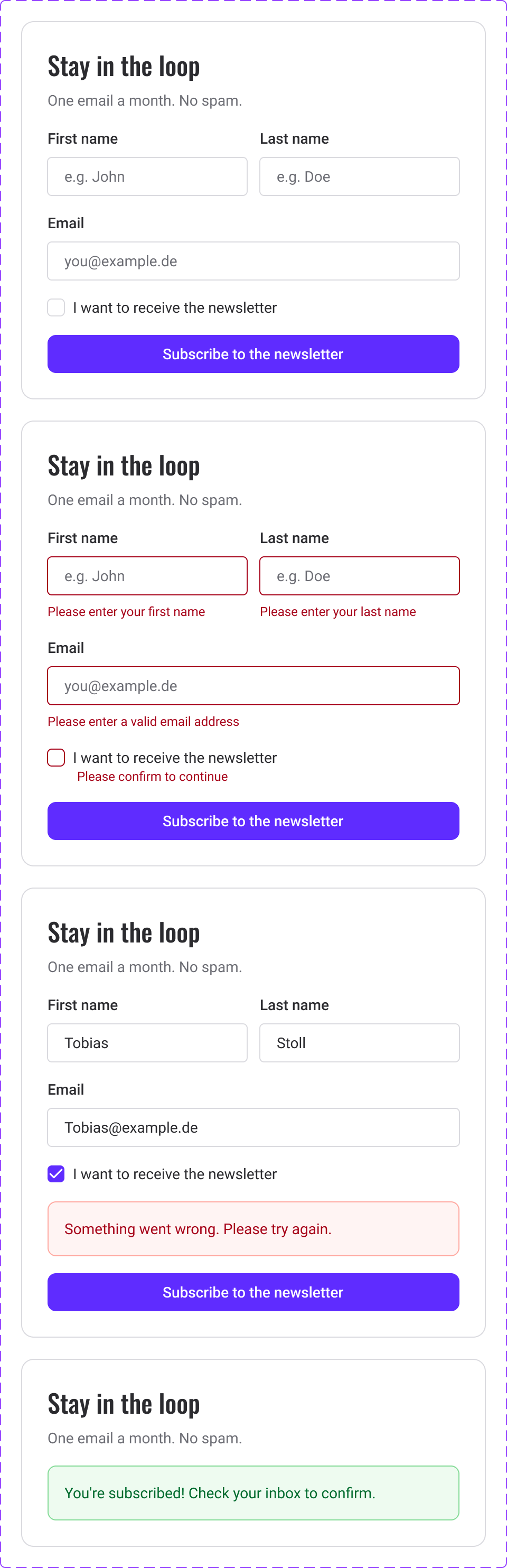
Everything comes together: three Form Fields, a Checkbox, an Alert and a Button. This one was translated straight from Figma via the Figma MCP.
Try it
Submit empty to see the errors, fill everything in to subscribe. Turn on the switch to see the server error.
All states
As in the Figma component set (node 46:774).
From Figma to code
One call to the Figma MCP (get_design_context) returned structure, variants and the variable bound to every layer.
| Figma | MCP output | In this project |
|---|---|---|
| Component set, State | React prop state | One card, states via classes and ARIA |
| Form Field instances | Raw markup per field | Reused .form-field + .input |
| Checkbox, Alert, Button | Raw markup | Reused .checkbox, .alert, .btn |
| Auto layout + variables | Tailwind with var(--space/gap/lg) | var(--space-gap-lg) from tokens.css |
| Min width 380 | min-w-[380px] | Names stack on narrow screens instead |
Design QA with the MCP
The MCP shows what is bound, not just how it looks. The first read found issues a screenshot would never show.
| Where | Read 1 | Read 2 |
|---|---|---|
| Input + checkbox stroke | sds-size-stroke-border (foreign library) | border-width/default ✓ |
| Checkbox error row gap | sds-size-space-300 (foreign library) | space/gap/md ✓ |
| Card border | input/border/default, width unbound | color/border/default + border-width/default ✓ |
| Input padding | button/padding-x, 8px hard-coded in error | input/padding-x + input/padding-y ✓ |
Tokens
Tokens used by the card itself. The nested components bring their own.